

Paste a client URL and hand back a UX audit in one minute.
Built for freelancers and agencies pitching a redesign. Clikiti opens the live page and reads it like a first-time visitor. You get a heatmapped canvas. Every finding is pinned to the spot on the page. The PDF carries your logo, not ours.
Attention heatmap
Where the eye lands first, modelled with no traffic and no tracking script.
Findings on the page
Every problem pinned to the exact region of your own capture.
The fix, ready to paste
Code written for the stack we detect, plus a report with your logo on it.
Free to run, no account. Every finding is readable on screen. You pay only to export the branded PDF.
Your audit opens as a canvas, not a PDF you skim
Not a score in an email. A canvas with your site on it: the whole page captured, lit up with heatmaps, cut into regions, with the reasoning beside each one.

Attention heatmaps on the real page
Where the eye goes first, what gets skipped, which call to action is losing, painted straight onto your own capture.
Findings pinned to a region
Every observation sits on the numbered box it belongs to. Click a region, read what is wrong with it, copy the fix.
Reconstructed user flows
Clikiti works out what visitors are trying to do on the page, then heatmaps each of those journeys separately.
Checks that catch the quiet failures
Dead clicks on things that only look clickable. Form friction. Buttons competing for the same attention. Copy that reads clearly to you but not to a stranger.
A canvas, not a checklist
Pan, zoom, add your own regions, rename them, re-scan a crop. It behaves like a design tool because that is how audits are actually read.
Heatmaps before you have a single visitor
Every other heatmap needs a tag on your site and months of traffic. Even then it only reports what already happened. Clikiti models where the eye lands on the first glance, and goes one further: it reads intent from the whole user flow. The page is scored against what the visitor came to do.
Measured on the real pixels
The capture is read area by area. How far each one stands out from what surrounds it. Whether the text is really text. What the true contrast ratio is. One bright cell is never enough to call something hot.
Intent read from the whole flow
Here is where the other tools stop. We do not score a screenshot in isolation. Clikiti reconstructs what visitors are actually trying to do, follows that path across the site, and heats every page against the job in hand.
Illustration of a first-glance map. Your scan paints this on your own capture.
Weighted by what things mean
Contrast alone gets web pages wrong. A face, a price or a submit button pulls the eye for reasons no maths can see. So the AI pass scores each region by what it is, and that weight multiplies the measurement.
Day one, on any URL
No tag on the page, no cookie banner, no waiting for a few thousand sessions before the map is readable. It runs on a page you shipped an hour ago, and on a page you do not own.
What this is not
This is first-glance attention, modelled from the page. It is not click tracking and it is not a conversion prediction. We will not put an accuracy percentage next to it until we have scored the model against a public eye tracking benchmark and can show you the numbers. Region boxes are estimated from the layout rather than measured in your browser, and the report says so on every one of them.
Prowl your competitor’s funnel and map how they sell
Paste any URL: theirs, not just yours. Hit Prowl and Clikiti follows every link in their nav and hero at once. It captures each landing page and lays the whole path out on a single zoomable board. Then you decide which page is worth auditing.
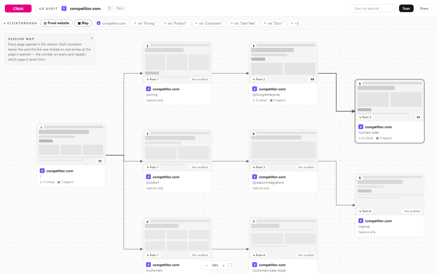
One button, their whole top of funnel
Prowl reads their nav menu and hero calls to action. It opens every one of those destinations at once, up to ten pages, and captures each one. Pricing, product, customers, docs, signup. The pages they spent the most money pointing you at.
The funnel laid out on one board
Every captured page lands on the session map as a card. It is wired back to the page it came from and labelled with the link text that got you there. You see the shape of their sales path in one look, instead of clicking through it blind.
Free to look, pay only for what you dig into
Prowling costs nothing: it is a capture, not an audit. Pages sit on the map as "not audited" until you pick the ones worth a full teardown. Audit their pricing page and leave the rest.
Works on a site you do not own
No script, no login, no access to their analytics. If a browser can open it, Clikiti can prowl it, which is the entire point of running this on somebody else’s funnel.

Most UX audits die in a forgotten document
Someone spends a week screenshotting pages into slides. By the time the deck lands, the site has already changed and nobody can tell which screenshot goes with which sentence. Clikiti keeps the audit attached to the page: the capture, the region, the reasoning and the fix all live in one place, and it takes a minute instead of a week.
Every other tool just runs a checklist
Scanners tell you a contrast ratio is 4.2:1 and a bundle is 380 KB. Useful, and completely silent on the thing that actually loses the sale: a hero that never says what the product is, three competing buttons, a form that asks for too much. Clikiti reads the page the way a visitor does, then explains, in plain sentences on the screenshot, why they left.


Hand it to your client with your logo on it
The workspace is for you. The PDF is for them: a clean, minimal document you can send to a client, put in a pitch, or attach to an invoice.
A paginated document, not a screenshot dump
Cover, summary, then one spread per region. The crop on the left, the observations on the right. The whole page sits in a locator rail on every page, so the reader never loses their place.
Bauhaus plain: black, white, grey
No gradients, no chrome, no product branding shouting over your work. Type, rules and one image per page. It reads like something a studio would charge for.
White-label in four values
Your name, your horizontal lockup, your round mark, your byline. Change them once and every report comes out under your studio identity.
One click, from the workspace
The same audit you were just panning around exports as a PDF you can email to the client without touching it.
How it works
Paste the URL
Any live page: your site, a client site, a competitor. Nothing to install, no account, no tracking script.
Watch the passes run
Clikiti captures the full page, works out what the page is for, splits it into regions, reads each one and models where attention goes.
Work it, then send it
Pan around the canvas and add your own regions. Copy the paste-ready fixes into your editor, then export the PDF under your own brand.


No scripts, no selectors, no tag to install on the site. Just a URL and about a minute.
Side by side with the tools you already pay for.
Scoring tools grade. Accessibility checkers cite rules. Heatmap tools need months of traffic. An audit workspace does the thing you actually need: show the page, mark what is wrong on it, and give you something you can send to a client this afternoon.
| Capability | Clikiti | Lighthouse | axe / WAVE | Hotjar-style heatmaps | A human UX audit |
|---|---|---|---|---|---|
| Reads the page like a personJudgement about copy, hierarchy and friction, not just rule violations. | Yes | No | No | No | Yes |
| Findings pinned to the screenshotEvery issue sits on the region of the page it belongs to. | Yes | No | Partly | Partly | Partly |
| Paste-ready fix codeWritten for the framework and styling system we detect on the page. | Yes | No | Partly | No | No |
| Attention and flow heatmapsModelled from the page itself. No tracking script, no waiting for traffic. | Yes | No | No | Partly | No |
| Client-ready PDF in one clickPaginated, printable, with the capture carried across every page. | Yes | No | No | No | Partly |
| White-label: your logo, your reportNeutral black-and-white layout designed to carry someone else’s brand. | Yes | No | No | No | Partly |
| You can edit and re-scan regionsRename, add or drop a region and the audit updates with it. | Yes | No | No | No | No |
| Result in under two minutesNo install, no account, no scheduling a call. | Yes | Yes | Yes | No | No |
| Costs nothing to runThe hosted audit is free while it is in preview. | Yes | Yes | Yes | Partly | No |
Comparison reflects what each category of tool is designed to do, not a benchmark run.
Agentic audits make you money
A scanner gives you a number nobody pays for. An agentic audit gives you an opinion, on the page, in a document with your name on it, and that is billable.
Win the pitch before the call
Audit the prospect’s site the night before and open with their own page on screen, heatmapped, with three specific things costing them conversions. That is a different conversation from “here is our portfolio”.
Sell the audit itself
A paginated, white-labelled UX audit is a product studios already charge for. The difference is that this one takes a minute to produce, so the margin is yours instead of the week you used to spend in a slide deck.
Turn findings into scoped work
Every observation comes with a severity and a paste-ready fix. That is a line item. The report writes the proposal for the redesign, the copy pass, the accessibility work.
Serve more clients per week
Agentic passes do the reading, the region splitting and the write-up. You do the judgement calls. One person can carry the audit load that used to need a small team.
Keep clients on retainer
Re-scan after every release and show the score move. A monthly audit is an easy renewal because the client can see what changed.
Prove the work you already did
Scan before, scan after, put the two scores side by side. Attribution stops being an argument.

Your next audit,
open on the page in a minute.
One URL in. A heatmapped workspace and a white-label PDF out.

Use it today. Hear about the rest when it ships.
Scanning is live right now and free to run. Leave an email and we will tell you when new lenses, deeper crawls and the next products land. Nothing else.